In following years, all car instrument clusters will change to fully digital displays, because they are essential for smart and interconnected vehicles. This change undoubtedly bring a new driving experience. For our client, an established manufacturer of luxury sport cars, craftsmanship sits at the heart of the brand from the very beginning. The client was, therefore, confronted with finding solutions for a full digital cockpit to stay competitive in nowadays technology-driven marketplace, while keeping the raw experience of a powerful and superiorly crafted sports car.
The project subsequently aimed to define the role and branding-fit appearance of their first-ever full digital cluster. Over nearly three months communicating with the client at intensive pace in several iterations, we evaluated their latest dashboard and re-defined the brand language by proposing new concepts.
As an UX architect in this project, I was dedicated to in-car user experiences consisting of heuristic review, information hierarchy and user interaction.
Project backgrounds and objectives
As the new wave of digitalization and IoT-based transformation is already under way, the client was seeking advices on their first full digital cluster design from Experientia srl, including identifying the role of clusters, visual language as well as interactions, which not only enable new holistic user/driver experiences, but also present their traditional fine craftsmanship.
Process
Usability evaluation
Conduct heuristic evaluation and usability testing to find usability issues of current cluster design
UX architecture
Build interaction architecture and wireframes
Design options
Iteratively propose cluster themes and concepts informing UX and brands
Usability evaluation
Conduct a heuristic usability evaluation of a first interface prototype from client side
Based on the established usability principles, through inspecting the interface elements and structure of the digital cluster interface design which had been delivered by the client, we identified usability problems and the severity respectively. All the problems were classified into six aspects—navigability, consistency, readability, error prevention, visual appearance and drive modes.
These six parts eventually composed a considerable evaluation report, supplemented with best practice showcases and design recommendations to formulate the possible solutions.


Collect usability issues by usability testing
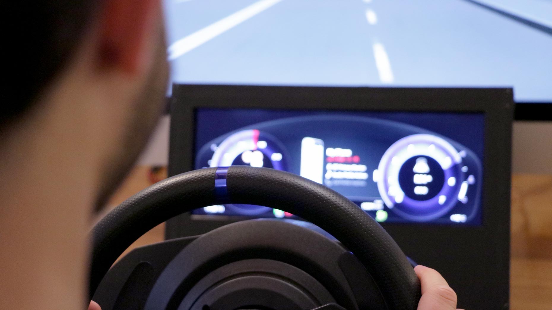
Addition to the heuristic evaluation, we build a driving simulator with the initial prototype interface and invited twenty drivers to be involved in the usability assessment. The session lasted about one hour, mainly aggregating impressions, cognitions, perceptions of the cluster’s interface and driving modes.


Issues reflected by participants were short-listed in either of three categories by the severity—navigation mechanisms, information and visual hierarchy, and information architecture.
The findings, complemented with the analysis of heuristic evaluation, were used for generating upcoming UX architecture solutions.
UX architecture
On the base of the findings of the usability evaluation, we represented the skeleton of the interface by starting with organising contents of the cluster. Wireframe design came straightaway after.
Build information architecture
We sorted the whole content assets associating priority and relations of each piece with bringing driving situation awareness into the discussion and then generated a visualised hierarchy.
Design initial key interaction and make wireframes
In line with information architecture, we designed interfaces of key interactions from scratch, finally rendered them digitally as wireframes to communicate our initial ideas of cluster design.


Design options
Iteratively propose cluster themes and concepts informing UX and brands
The team was split to develop detailed design in three directions, which emerged by the preceding usability assessment, interface framework and client feedback.
The detailed design respecting navigation hierarchy of menus, features and brand languages blended craftsmanship and digital required thinking through various tasks and scenarios for optimum UX.
Beside to iteratively collaborating with the client and a graphic designer and a motion maker within my team, I created the navigation hierarchy and UX which features personalised contextual communication and bespoken exclusive information along with a simplicity theme.

Results and Impacts
The client was impressed by the subsequent final three design options of the first-ever full digital cluster, which UX was reinforced by the results of usability heuristic evaluation and driver-involved testing. These design options have been reported to higher managers of the client with the prediction of a continuous UX guidance from Experienta for their full digital cockpit solutions.