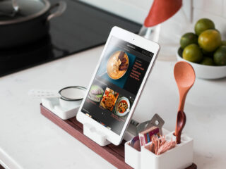

CAMA Coffee Roaster app is an online shop where coffee enthusiasts can order highest-quality coffee; enjoy CAMA art; book a table or events in the café and immerse into the savory world of coffee.


Design Challenge
CAMA Coffee Roaster is a Taiwan-founded café aiming to fulfill high-end coffee demands, while CAMA Coffee is a fair price brand of coffee-to-go under the same cooperation. To distinguish CAMA Coffee Roaster from the well-known CAMA Coffee was the challenge of this project.
Design process
The project started from reinforcing its brand identity through reviewing the overall brand styles. The app afterwards was devised to bring in the idea of elevating business and service throughout ideation, wireframing, UI design, user test and design optimisation.
Brand guideline creation
Referring to CAMA Coffee Roaster’s existing website together with their new brand plan documents, brand guidelines were streamlined and specified to manifest its core value:
CAMA Coffee Roaster offer highest-quality coffee in historical architectures located in the heart of cities. Coffee enthusiasts can easily access us to get a cup of coffee, see arts, join coffee making tours, having the best class of immersive sensation experiences.


Ideation & wireframing
The main value of the store app is to bring the experience from the flagship roaster café to many coffee enthusiasts’ home and enable them to interact with the actual place. Through the app, they can order coffee, book tours or spaces and look at curated CAMA culture contents.
Among all features, coffee ordering most attractive to generate a win-win both for the business and customer. The flow of it was therefore developed with showing four primary users’ needs: browse, filter, recommendations and multiple payment options.
Based on the flow, the interface concept was soon also sketched out.


The concept was then presented digitally as wireframes. By taking advantages of wireframes which were built by blocks, the concept was restructured back and forth several times to smooth the flow across different features as well as to best fit the iOS design guideline.


UI design & user testing
As soon as the wireframes presented pleasing user experiences, the app interfaces from grid system, styles, icons, elements, components to pages were carried out in details in aligned with the brand guideline defined in the beginning of the project.
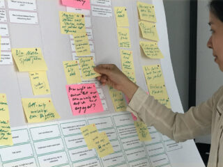
The created app UI soon later was reviewed through video call and Figma by five target coffee enthusiasts located in Taiwan.

UI optimisation
In the user testing sections, many improvements including usability issues, misleading wording, unmet features and improper aesthetic design were collected. The app interface, for example, the spacing between the menu items and text fields, the style of Add to Cart button, the background opacity and the sequence of checkout steps were then enhanced according to the test results.