
E- Goers app is part of the innovation project of EZY-CRD-GO partially funded by the European Union. It supports attendants of public or semi-public mass events to find the way in and out, avoid crowds and get instant (emergency) information/ services throughout the journey of the event through IOT solutions. The mission of E-Goers is to let attendants stay calm, safe and enjoy the event.
Through co-working with Experientia who was partnering with EIT Digital, I delivered the UIs of Android and iOS app.

Design Challenge
Most challenging in this project was the trade-off between convention and innovation. As the app is about security, the design should be clear and intuitive, so there is no steep learning curve for users. On the other side, the design should look original to demonstrate the cutting-edge initiatives of the app, connecting IOT with outdoor leisure time.
Design process
For this project I was collaborating with Experientia srl. And was developing concepts and interface designs. Based on the concepts validated with user tests conducted by Experientia, I created an app interfaces of both iOS and Android platforms to embody the final vision of the service. The key steps included:
User journey/flows mapping
Referred to the design concepts offered by Experientia, I was informed the MVP of the project, through which the role of the E-Goers in the EZY-CRG-GO system was also clearly addressed.

The thinking was then narrowed down to the app – with the usage scenario, user flows were visualised to show how users can benefit from the app prior to, during and after the event respectively. Among the multiple possible storylines, the solid line here shows the focus of the project to demonstrate the app’s features.


Wireframing
E-Goers supports both Android and iOS. Through user flows, the structures of the app interfaces were designed by following the design guidelines of Material Design and iOS, together with the corresponding pattern libraries. Below are a few of key frames of Android devices:


UI design and User test
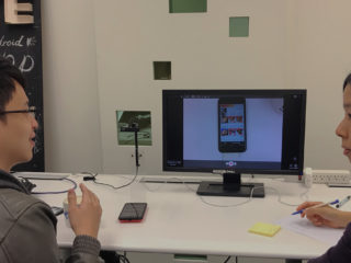
Based on the wireframes, interfaces were created. In oder to make sure the design is clear enough for use, as the challenge described, user testing was carried. Three Android and three iOS users were invited to test out the UIs through Figma. Each user spoke out their perception, as well as pros and cons by executing pre-planned tasks.

UI fine delivery
In response to test results, a number of tweaks have been made to improve the experience:
Navigation:
- Changed the tab wording of Event as Current Event to reduce confusion
Homepage:
- Adjusted the contents inside the EVENT INFO on the homepage to make the app more focus on instant communication. Users therefore can find critical/real-time information when needed.
- Added timeline-based information inside PLACES on the homepage
My Ticket:
- Added the title of Current Event above the main ticket section
- Changed the text colour My Tickets on iOS, so it looks like clickable.
Final UIs including interfaces, icons contents and interactions were created and shared with Experientia so the clients could have gained inspirations on app design and services.